Influenza Forecasting
A medical staffing agency, responsible for providing temporary workers to hospitals on an as-needed basis, requires assistance in planning for influenza season.
-
As a data analyst, my goal was to analyse influenza trends focusing on vulnerable populations, especially those over 65 years old, to proactively plan for staffing needs across the U.S.
-
This project used 2 datasets:
Population data by geography, time, age, and gender - US Census Bureau
-
Excel was used for a large portion of this project, from data cleaning, integration, transformation, and statistical hypothesis testing.
Tableau was used for further visual analyses as well as constructing a final presentation using dashboards.
-
This is a project I completed as part of the data analytics course at CareerFoundry.
Approach and Process
Data Preparation
Cleansed both datasets of inconsistencies, duplicate values, and addressed missing values.
Integrated datasets using the VLOOKUP function in Excel.
Grouped age ranges and normalised influenza mortality rates for data analysis.
Further details of the data transformations and merging can be looked at in this Excel file.
Final integrated dataset, fully prepared for statistical analysis and Tableau analysis.
Data Analysis
Hypothesis testing - determined whether the mortality rate for older individuals (65+) was higher than other ages. This helped direct the focus of the analysis on this vulnerable population.
Visual analysis - used Tableau Public to determine the seasonality of influenza cases and deaths. Maps were also used to show the distribution of influenza cases and vulnerable populations across the United States, thus leading to recommendations for where to send additional staff.
Filters and highlighters were also added to various charts to create a more dynamic final presentation.
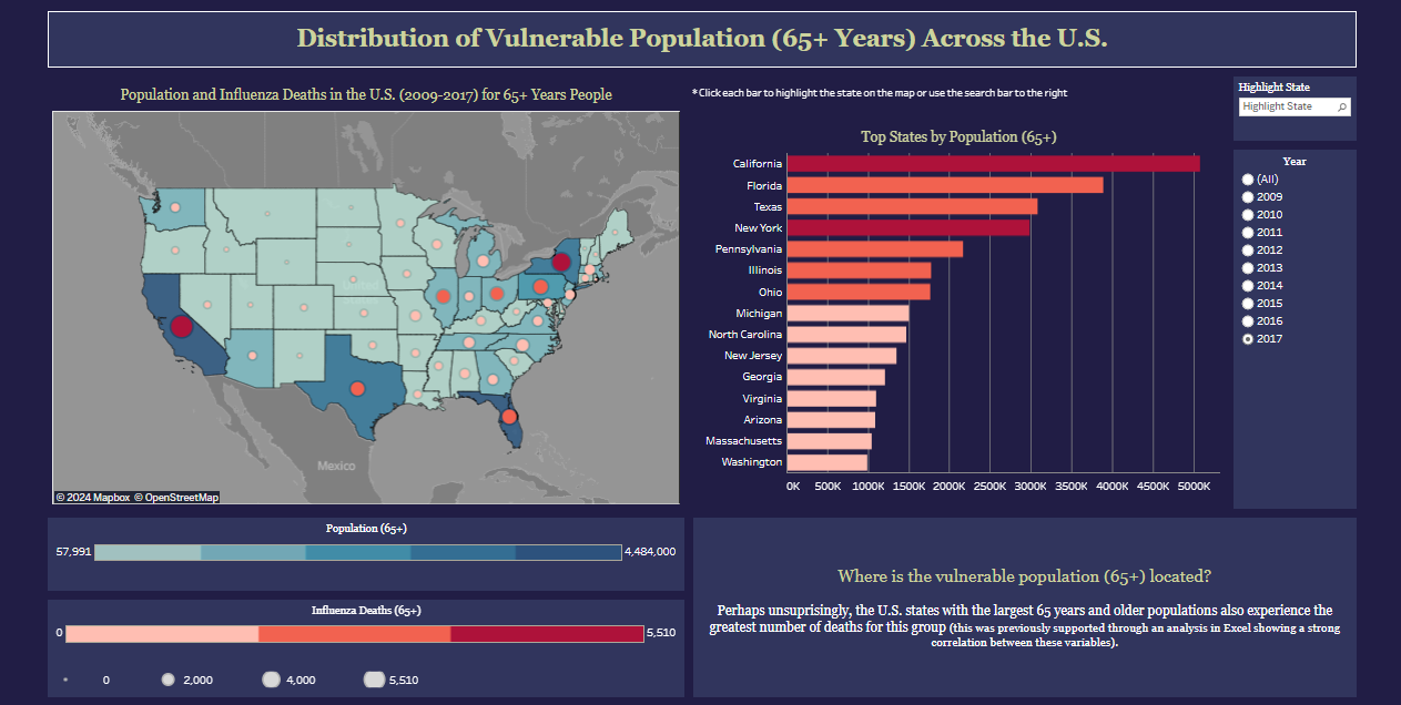
Dashboard with map and bar chart comparing vulnerable population totals and deaths across each state.
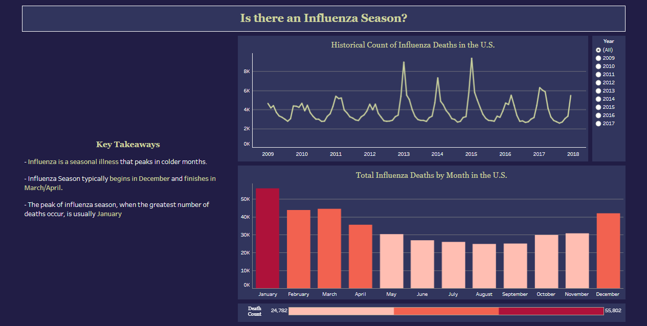
Dashboard showing seasonality of influenza. The year filter allows further analysis into changes overtime.
Presentation and Recommendations
Tableau Dashboards were refined and compiled into a storyboard. This storyboard was used in a video presentation for [hypothetical] stateholders at the medical staffing agency.
The final dashboard shows a map categorising each states’ staffing priority level assigned by total deaths amongst the vulnerable population in each state.
This dashboard also highlights how staffing prioritisation could be aided by providing hospitals’ and clinics’ staff-patient ratios, thus understanding where shortages are truly affecting the quality of care to patients.
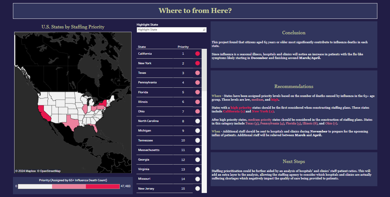
Final dashboard highlighting findings, recommendations, and ways to improve the analysis in future.
Results and Deliverables
Summary of Results
Categorised states into 3 tiers of staffing priority.
Identified peak staffing needs will most likely occur from December to March (influenza season).
Recommendation for further analysis regarding hospital and clinic staff-patient ratios made.
Deliverables
Interim Report: documentation of project progress and findings, including data limitations, descriptive and statisitical analysis, and next steps.
Tableau Storyboard: interactive storyboard containing visualisations and recommendations.
Video Presentation: Screecast walkthrough of storyboard with explanations of project analysis and highlights.